Where your chat widget sits on the page decides whether visitors see it as helpful or as clutter. Put it somewhere sensible and it quietly waits until someone needs it. Put it somewhere careless and it covers your checkout button, fights your cookie banner, or pops open over the exact paragraph the visitor was reading. Placement is a small decision with an outsized effect on both chat usage and page conversion.
This guide covers the defaults that work for most sites, the mistakes to avoid, and how placement should change by page type and device. Everything here applies to any live chat vendor — the principles are about human attention, not software settings.
The Default Position That Works for Most Sites
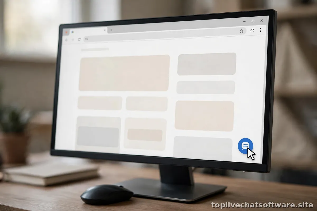
Bottom-right on desktop. That is the answer for roughly 80% of websites, and there are good reasons it became the standard. Visitors have been trained by years of chat widgets, support bubbles, and messaging apps to glance to the lower-right corner when they want help. It sits outside the main reading flow, so it never interrupts scanning, and it rarely collides with left-aligned navigation, sticky headers, or right-to-left language layouts when mirrored correctly.
The main exception is mobile, where the bottom-right corner is prime thumb territory and competes with sticky add-to-cart bars and cookie consent buttons. On phones, bottom-right still works if nothing else lives there — but audit it on a real device, not just a desktop browser resized to phone width.
If you take one thing from this guide: place the widget bottom-right, keep it closed by default, and make sure it never covers a call-to-action button on any screen size. That alone avoids the vast majority of placement complaints.
Placement Do’s, With Examples
- Do keep it closed until invited. A small launcher bubble is an invitation; an auto-expanded chat panel is an interruption. Let the visitor make the first move, with proactive triggers as the only exception — and those should be rare and targeted. (See our triggers guide for the rules.)
- Do match it to your brand. Set your colors and logo so the widget reads as part of your site. A generic blue bubble on a carefully designed page signals “bolted-on tool” and gets ignored.
- Do give it breathing room. Offset the launcher 20–30 pixels from the viewport edges so it does not touch the browser chrome or collide with scrollbars. On pages with sticky bottom bars, raise the widget above them or suppress it on those pages entirely.
- Do show it where intent is highest. Pricing pages, product pages, checkout, signup, and support documentation are the pages where a question is most likely to be the difference between converting and leaving. Make sure the widget is prominent — and staffed — there.
- Do consider a text link alternative. On long-form pages like detailed guides, a simple “Questions? Chat with us” text link near the relevant section can outperform a floating bubble, because it appears exactly where the question forms in the reader’s mind.
- Do test with your cookie banner. In regions with consent banners, the banner and the widget often fight for the same corner. Decide which sits above which, and re-test after every banner redesign.
Placement Don’ts, With Examples
- Don’t cover primary buttons. If the widget overlaps “Buy now,” “Start trial,” or “Submit,” you are trading your most valuable clicks for chat visibility. Check every key page on mobile, where overlap is most common.
- Don’t put it top-right or center-screen on load. Center-screen chat panels on page load are the popup ads of customer support. They spike close rates, tank the page experience, and teach visitors to reflexively dismiss your chat forever.
- Don’t show it on every page. Thank-you pages, order confirmations, legal pages, and the inside of your app’s settings screens rarely benefit from a chat bubble. Suppress the widget where it adds noise, not value.
- Don’t let it follow visitors into sensitive flows. Payment forms and account deletion flows deserve full attention. A chat bubble hovering over a credit card form reads as surveillance, not service.
- Don’t forget right-to-left layouts. If your site serves Arabic or Hebrew readers, mirror the placement — bottom-left is the natural corner there. A widget parked over your mirrored navigation looks broken.
- Don’t stack multiple floating elements. Chat bubble plus cookie banner plus promo popup plus back-to-top button equals a corner full of competing chrome. Audit the full stack on a small laptop screen and a phone.
Placement by Page Type
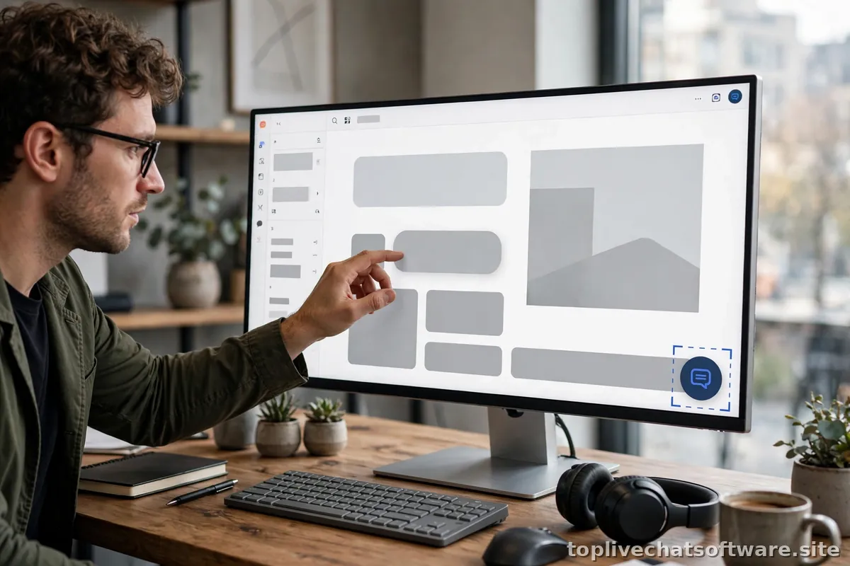
One position does not fit all pages. Use this table as your starting configuration, then adjust based on where your chats actually come from:
| Page type | Recommended placement | Notes |
|---|---|---|
| Homepage | Bottom-right, closed bubble | Keep it subtle; homepage visitors are browsing, not stuck |
| Pricing | Bottom-right, closed bubble | Your highest-value page for chat — consider one proactive trigger here |
| Product / feature pages | Bottom-right, closed bubble | Add contextual text links (“Ask about integrations”) near complex sections |
| Checkout / signup | Bottom-right, raised above sticky bars | Never cover the payment button; one idle-time trigger maximum |
| Support docs / FAQ | Bottom-right, closed bubble | Trigger after 60+ seconds or on second article visit — a strong escalation signal |
| Blog / content | Bottom-right or suppressed | Suppress on top-of-funnel posts; keep on product-adjacent articles |
| Contact page | Optional | Chat and a contact form side by side is redundant — pick one as primary |
| Thank-you / confirmation | Suppressed | The task is done; don’t interrupt the moment |
Mobile Placement Rules
More than half of most sites’ traffic is mobile, and mobile is where placement mistakes hurt most — a bubble that is a minor visual element on desktop can cover a third of a phone screen when expanded. Follow these rules:
- Open as a near-full-screen panel. When a visitor taps the launcher on a phone, the chat should take over most of the viewport with a clear, thumb-reachable close button. A tiny desktop-sized window on mobile is unusable.
- Keep the launcher clear of sticky bars. If your mobile site has a sticky add-to-cart or navigation bar at the bottom, offset the chat launcher above it. Test on both iOS and Android — safe-area insets differ.
- Disable auto-expanding triggers on mobile. A proactive chat that slides open on its own is merely annoying on desktop; on mobile it hijacks the entire screen. Keep mobile triggers to a badge or gentle pulse on the launcher.
- Mind the keyboard. When the visitor taps the message field, the on-screen keyboard appears and the chat must resize gracefully. Test an actual multi-message conversation on a real phone, not just the open state.
Launcher Microcopy: The Words on the Bubble
Placement is not only geometry — the text on or near the launcher shapes whether visitors perceive it as help or as marketing. Most widgets let you set a short teaser line beside the bubble. This microcopy deserves the same care as the position:
- State availability honestly. “Typically replies in under a minute” is a promise; make sure your staffing backs it up during the hours the teaser is shown. If replies actually take an hour, say “We reply within a few hours” or show nothing at all.
- Match the page’s intent. A generic “Chat with us!” works everywhere and converts nowhere in particular. On the pricing page, “Questions about plans?” outperforms it; on support pages, “Stuck? Talk to a human” does. If your platform supports per-page teaser text, use it.
- Keep it under six words. The teaser is a glance, not a sentence. Anything longer gets truncated on mobile or ignored on desktop.
- Never fake a human. “Sarah is online!” when no Sarah exists — or when “Sarah” is a bot — destroys trust the moment the visitor notices. A simple “Chat with our team” is always safe.
Test microcopy the same way you test position: change one variable, watch chat-initiation rate for two weeks, and keep a log. Small wording changes regularly move initiation rates by double-digit percentages, which makes this the cheapest optimization in the placement toolkit.
Z-Index, Overlap, and Accessibility
Three technical details separate professional placement from amateur hour. First, z-index: your widget needs to sit above page content but below critical overlays like cookie consent modals and age gates, or it will trap visitors behind an unclickable layer. If your vendor lets you set the z-index, start around the value your cookie banner uses and adjust from there. Second, focus management: when the chat panel opens, keyboard focus should move into it, and the Escape key should close it — this matters for keyboard-only users and is required for decent accessibility. Third, reduced motion: respect the visitor’s motion preferences and avoid bouncy entrance animations for the launcher.
For a broader accessibility baseline, the live support software overview on Wikipedia is a useful neutral reference on how these tools are expected to behave, independent of any vendor’s marketing.
How to Test Your Placement
Placement testing takes twenty minutes and saves weeks of “why is nobody chatting” confusion. Open your five most important pages on a desktop browser, a tablet, and a phone. On each, confirm: the launcher is visible without scrolling, it does not cover any button or form field, it does not clash with the cookie banner, and opening the chat does not hide the content the visitor was reading. Then trigger your proactive messages and confirm they appear once, politely, and never on mobile as a full takeover.
Repeat this audit quarterly, or after any redesign — placement is not a set-and-forget decision. It belongs in the same review cycle as the rest of your live chat implementation checklist, because every site change is a chance for something to start overlapping.
Conclusion
Good chat placement is invisible: visitors never think about where the widget is, they just find it when they need it. Start with bottom-right and closed by default, tune by page type using the table above, treat mobile as a separate design problem, and re-audit after every site change. Get this right and your chat becomes part of the furniture — always there, never in the way.